Problem
Nearly 20% of users attempting to verify their accounts through micro-deposits were unsuccessful, forcing them to wait 2–4 business days (often up to a week) before trying again; preventing many from completing money transfers.
Solution
From research insights and talks with customer service, I created and updated screens for the micro-deposit process.
Desired Outcomes
- Reduce the current 20% failure rate of verifying micro-deposits
- Reduce call volume surrounding external accounts and micro-deposits
- Reduce negative feedback towards system navigation
My Contributions
Led strategy, research, UI, and UX while collaborating closely with a ux writer, product and customer service teams.
Who are the users
People trying to transfer money. Many users are expecting to transfer funds quickly.
What is the current experience
- Users were confused between “Linked Accounts” and “External Accounts”. Linked accounts only allowed viewing balances, while external accounts were needed to transfer funds.
- There was no upfront communication letting users know it takes 2-4 business days to receive micro-deposits and another 2-4 days to transfer funds.*
- * If the verification is unsuccessful, it will take another longer.
- Users were only notified by email when their micro-deposits were ready, and the email used outdated interface instructions.
- The amount fields were confusing, and there was no review screen before submission.
1. Understand Current Experience
Review screens, communicate with others who know the experience (customer service, other designers, engineers...)

Figure 1. Flow chart showing the existing experience
2. Observe and Listen to Users
To understand why, I listened in on specific calls to the call center related to micro-deposits and heard first-hand what problems users were having.
Figure 2. Screenshot showing calls to the call center related to micro-deposits
3. Find and Extract Pain points
Existing problems were found through observations, listening to customer calls, reading opinion lab feedback, and speaking with customer service reps. The whole micro-deposits journey had opportunities for improvement.
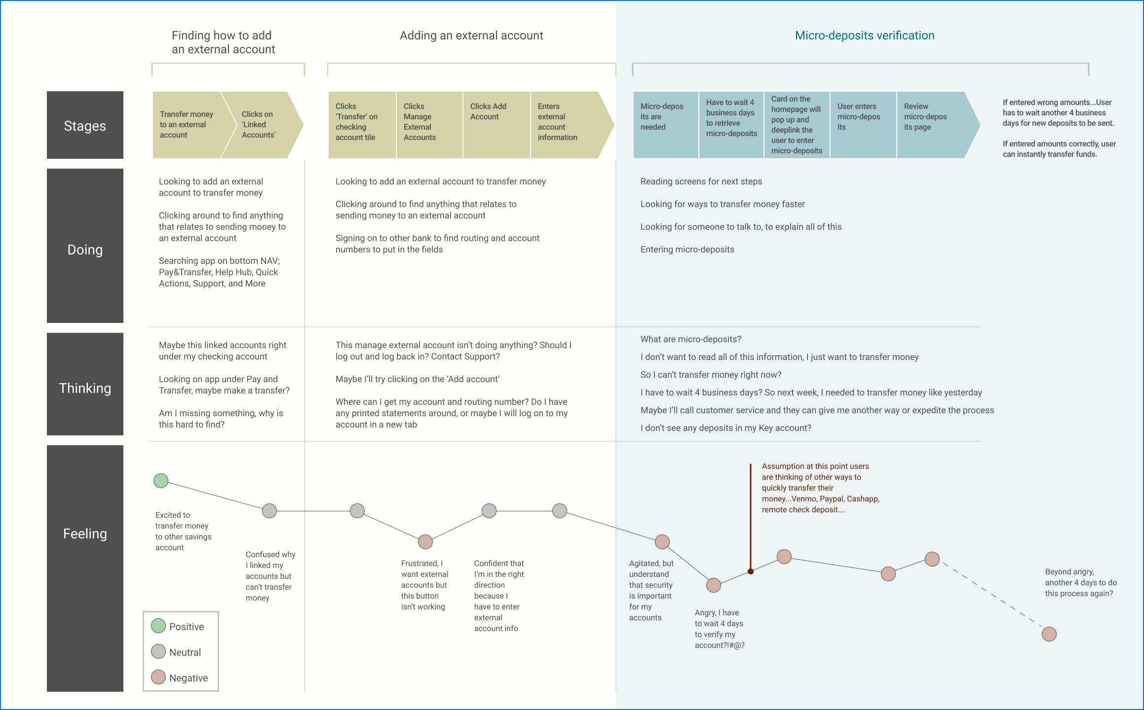
Figure 3. User Journey and mapping experiences along the way.
4: Heuristic Evaluation and Content Audit
From content audit and listening to users, there were numerous pain points throughout the process; below are opportunities found for the micro-deposit screen:
- The screen displays too much unnecessary information.
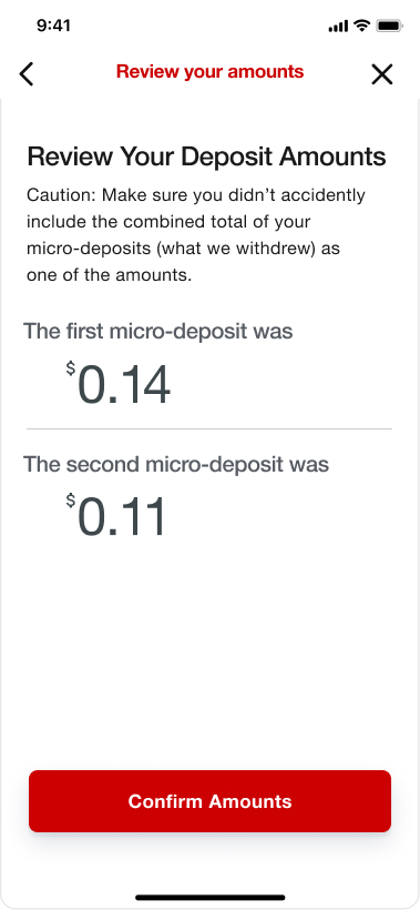
It’s important to evaluate what’s essential and show only what’s relevant to the user. - Users were confused by the four input fields.
Depositing two amounts should only require two fields. - Users would look for the micro-deposits in their KeyBank account, not the external one.
The message should clearly say the deposits are made into the external account. - Some users were adding an extra decimal without realizing one was already in the field leading to errors.
Making the decimal more visually distinct helps prevent this. - Users tended to pair the top amount from their account with the top input field, causing mistakes.
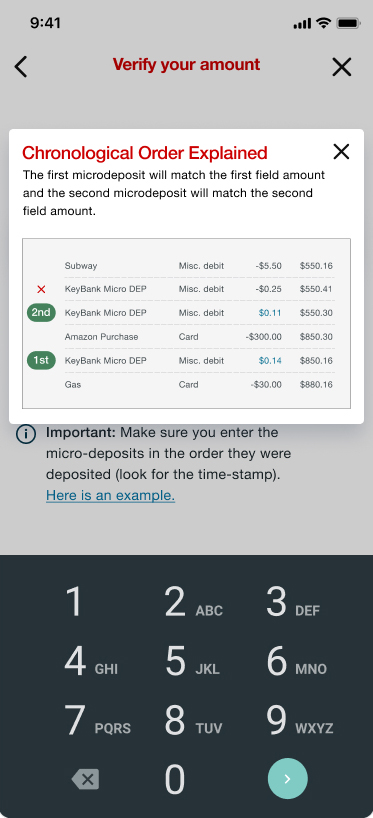
Presenting the fields on separate screens was thought to help users slow down and read the instructions correctly. - There seemed to be confusion around the correct order of entering amounts.
Adding a visual example of an account makes it clear that the bottom amount needs to be entered first.

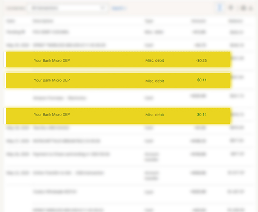
Figure 4. Showing the screen to enter the micro-deposits and a bank account with the deposits.
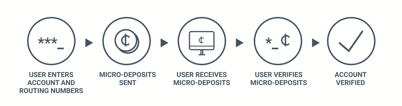
5: Proposed Solutions
These solutions were created based off of feedback from moderated usability tests and users contacting the call center. The image below shows the flow for micro-deposits, with the blue boxes symbolizing updated or newly created screens throughout the flow.

Figure 3. New screens and designs
Updated Changes from Feedback
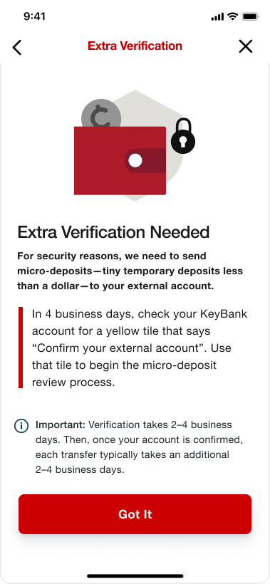
- To improve transparency, a screen will explain the purpose of micro-deposits and inform users that the process can take up to 8 business days, with transfers potentially taking two weeks.
- Let users know the deposits went to their external account, not KeyBank, to avoid confusion.
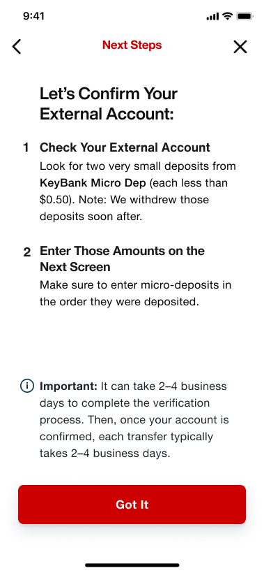
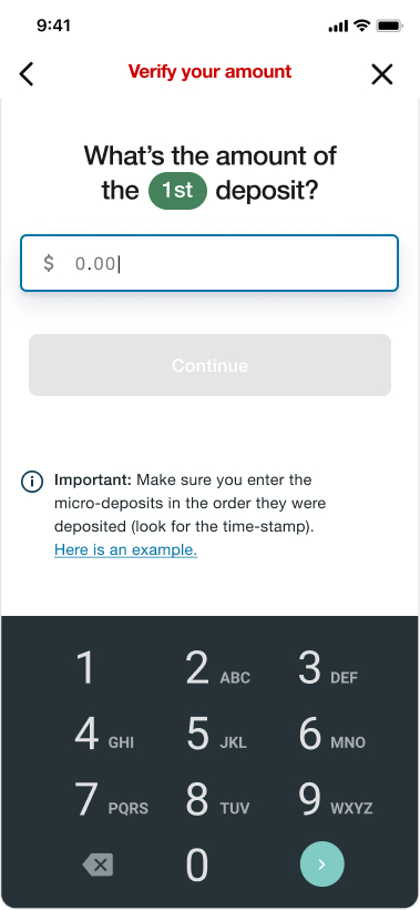
- Putting each field on a separate screen prevents mistakes, and removing extra fields reduces user confusion.
- A visual and clearer copy will show users the correct order to enter amounts, since the first deposit appears at the bottom of their transactions.
- Implementing a review screen allows users to verify their input before submitting.