Problem
Completion rate for returning customers were low in Tax Year 2023, with 58% of the drop-off occurring in the product’s opening sections.
Solution
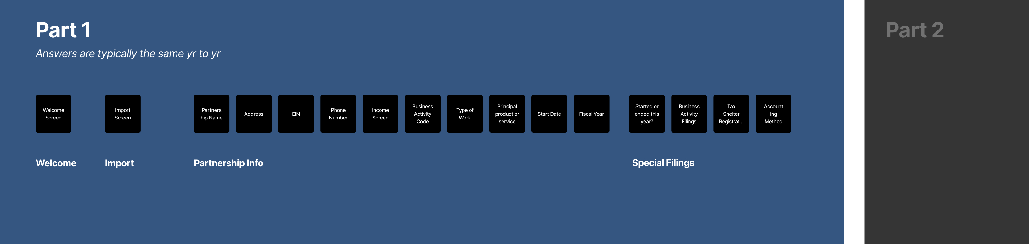
Successfully simplified the user journey by consolidating 30+ screens of information into 2 screens.
Results
- Increased NPS score from 49.3 to 56.2
- Reduced avg time to complete 1065 (Partnership) taxes by 4 days
- Decreased exit rate: 36% to 20%
- Improved completion rate by 10.7%
- Squad was recognized by CEO and other leaders
My Contributions
Led strategy, research, UI, and UX while collaborating closely with product and customer service teams. Successfully convinced the Product Manager and stakeholders to combine sections of screens into summary screens.
View Prototype1. Empathize: Discovery & Research
Objectives
- Understand who the users are
- Understand what the current experience is
- Look at competitors and how TaxAct compares
- Understand the business need
- Identify user pain points, behaviors, and motivations
- Gain insights from analytics and customer service representatives
Who are the users
People who have completed their taxes with TaxAct in the past and returning to complete their taxes again.
What is the current experience
- Content was confusing on some of these screens
- Lack of additional details (users have to go to Google a lot)
- Placement of some questions were confusing in this section
- Returning users have to go through every question again and hit continue with their answer populated from how they answered the previous year
Existing Screens

Captured the whole experience to document all the screens and pain points.
Stakeholder Conversations
I introduced myself to the customer service team and built a partnership to learn from their call experiences. This helped to identify which screens users most often struggle with and pinpoint the elements causing confusion.
How competitors compare
- Competitors are putting all of the questions on 1 screen where TaxAct has made each question a screen of it's own
- Competitors have concise, digestable pieces of information where TaxAct has paragraphs of information
- Competitors make content easy to understand
Competitor summary screens
Competitors put their basic information on a summary screen.
2. Ideate and Prototype
Design Objectives
- Translate research insights into structured design concepts
- Develop designs to map out user flows and interface structure
- Create interactive prototypes to test key workflows and identify usability challenges
- Iterate on functionality, navigation, and overall experience based on user feedback
Design Mocks
Focused on creating solutions that address user challenges while aligning with business goals. While almost all business users use desktop to file their business taxes, it is still important to think of the future and smaller screen sizes when designing.
Summary screen iterations

Mocks of different summary screen layouts.
3. Test and Learn
Testing designs with users
By prototyping and testing with real users, we refined the designs to ensure they were practical, scalable, and effective in improving user engagement and adoption.
Research Goals
- Understand if users prefer Design A or Design B and why
- Results:
- We found Users had a strong preference towards one of the designs
- Direct feedback was less scrolling from users ---> our insight based on the comments were that it was less cognitive effort to find the information needed
A|B testing users to understand which design they prefer and why.
A|B testing users to understand which design they prefer and why.
4. Launch
Old to new designs
While looking at the painpoints the old designs created for users we also found opportunities for newer designs that could enhance the experience.
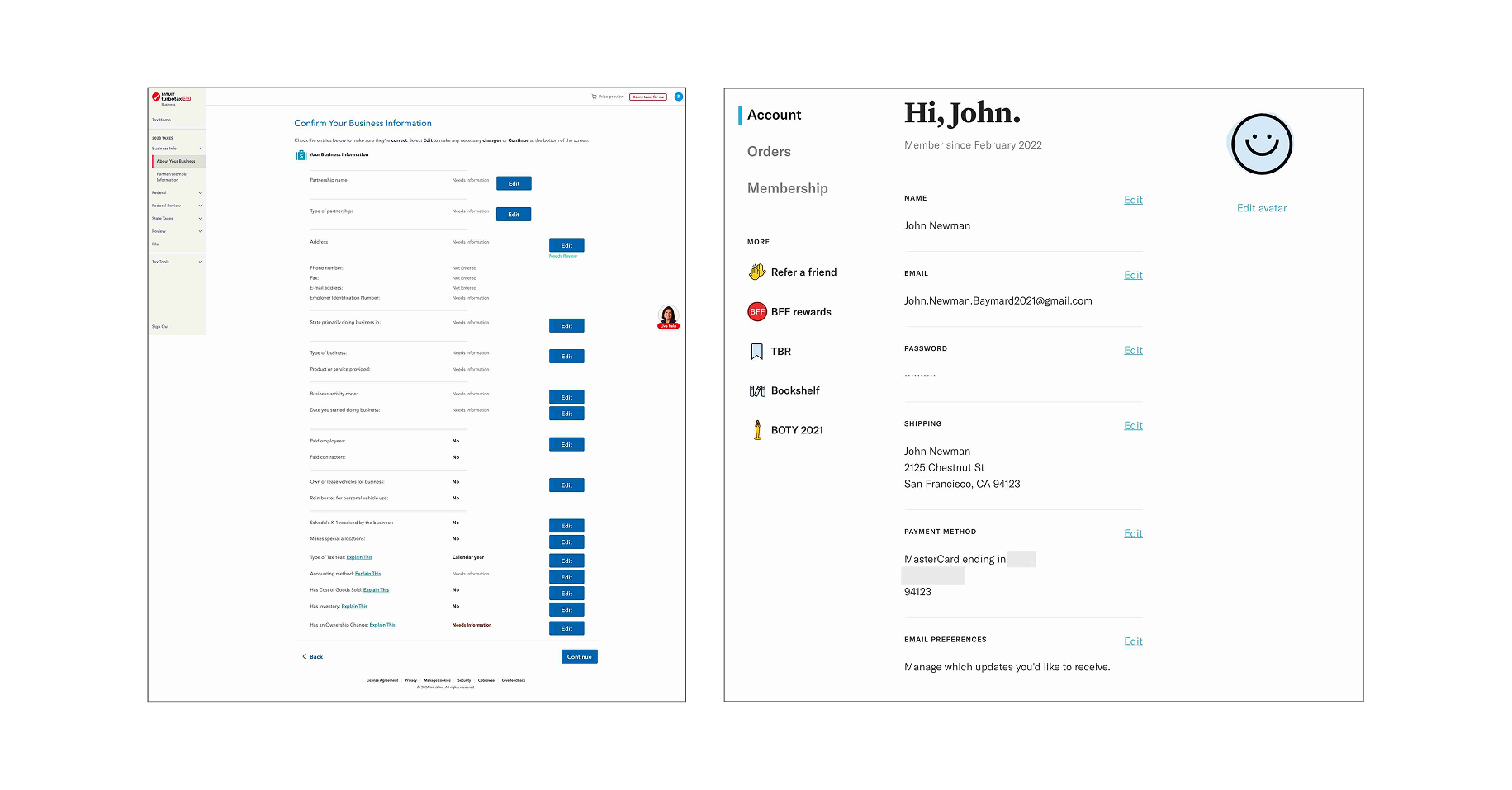
Basic Info Screen Designs

Old design - 14+ screens
New designs - 1 screen summary
Why this worked
- Condensed 12+ screens of interactions to 1 summary screen
- One consolidated summary screen for users to easily know how to get back to
- Revised the copy to a 5th grade reading level and got straight to the point
- Gave every statement an additional info for users who needed further clarification