The Problem
In Tax Year 23, the completion rate for returning customers dropped sharply, with 58% of their abandonments occurring in the product’s opening section.
My Contributions
Successfully convinced the Product Manager and leaders on this design solution. Originally, the Product Manager just wanted to have a blurb on each screen that said this is how the user answered last year.
Impact
After implementing these changes we found that on avg, returning users spent 4 less days completing their business taxes. Our team was acknowledged by the CEO and other executives from the positive results.
Other Success Results:
- Increased NPS score: 49.3 to 56.2
- Decreased exit rate in basic info: 36% to 20%
- Improved completion rate by 10.7%
- Reduced avg time to finish business taxes from 12 days to 8 days
1. Empathize: Discovery & Research
Objectives
- Understand who the users are
- Identify user pain points, behaviors, and motivations
- Understand what the current experience is
- Look at competitors and how TaxAct compares
- Understand the business need
- Gain insights from analytics and customer service representatives
Who are the users
First was to try and understand who the users are and what painpoints they are experiencing; we did this through looking at end-to-end research notes/videos, talking to customer service representatives, and our own testing.
Research Findings
- Confusion with the content on most screens
- Lack of additional details (users go to Google a lot)
- No visual indicator for progress of a section
- Unclear navigation
We spoke to numerous business users to find pain points and understand where and why users were confused.
What is the current experience
- Difficult to know where you are or how to navigate around
- Information overload on each screen and confusing
- Returning users have to go through every question again and hit continue with their answer populated from how they answered the previous year
Captured the whole experience to understand all the paths and questions being asked
How competitors compare
- Competitors are putting all of the questions on a running list summary where TaxAct has made each question a screen
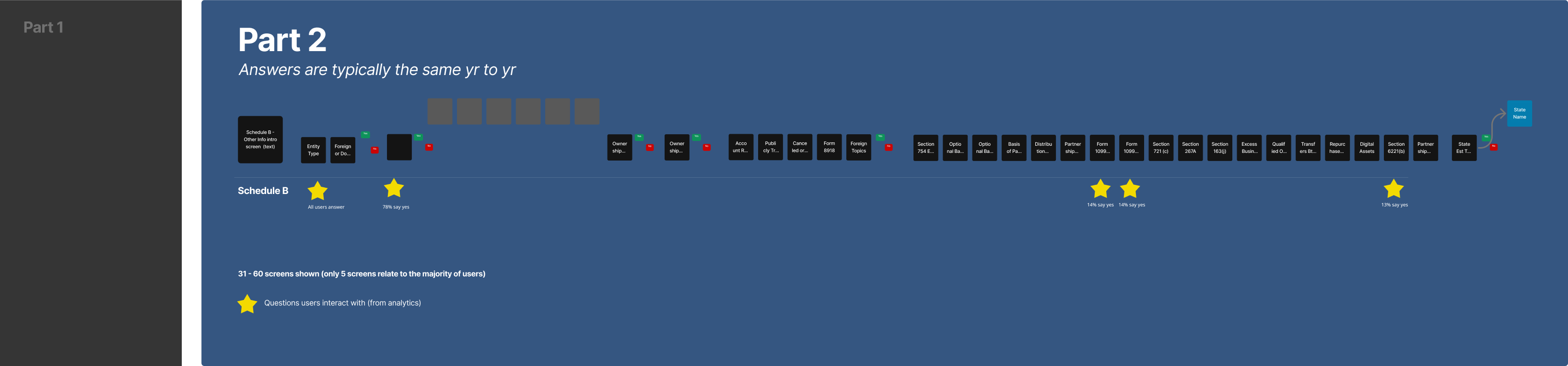
- Most of the Schedule B section does not relate to users (Verified with analytics that only 3-5 screens out of the 30+ are answered)
- Overwhelming amount of information on each screen
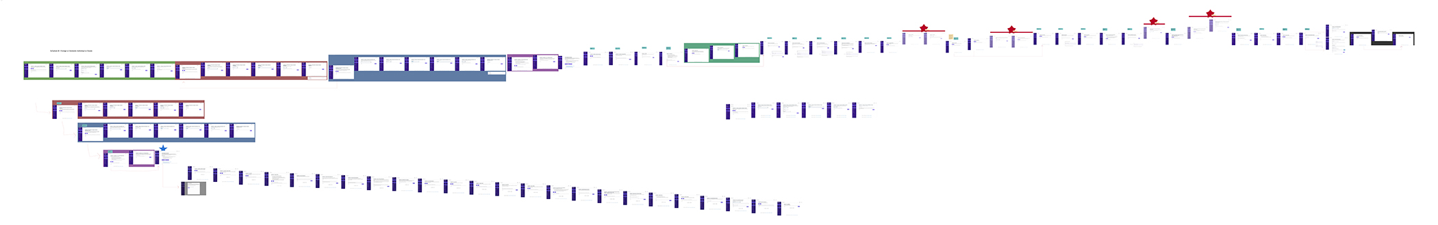
- Painpoint found: For Schedule B TaxAct had ~30+ continuous screens of questions while TurboTax and the original IRS had the same information on as a list

Visual mock showing TaxAct flow vs competitors

TurboTax and the IRS Schedule B questions.
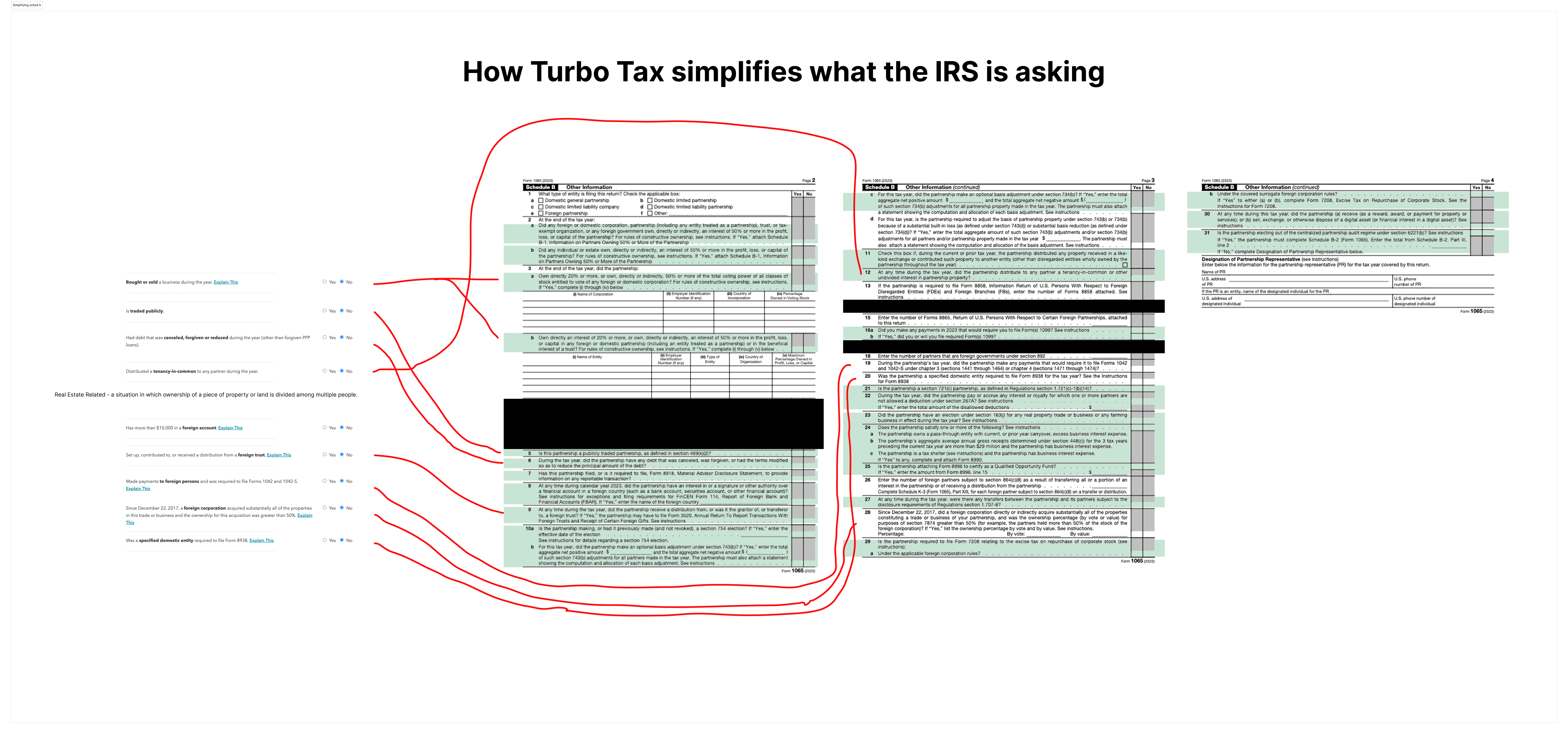
Looking at use of copy for questions from TurboTax and the IRS and comparing them.
Hypothesis
Consolidating 30+ screens of information for a returning user will reduce time & cognitive load, will be more consistent with our new Business Info screen and will give confidence and clarity where this info can easily be accessed later.
- From analytics, we found that the majority of users only are relating to a few questions:
- 78% of our users only have 6-8 screens (questions that relate to them) and have to read and skip through 30+ screens of info.
- The other 22% of users only have 0-3 screens (questions that relate to them) and have to read and skip through 28 screens of info.
2. Ideate and Prototype
Design Objectives
- Translate research insights into structured design concepts
- Develop designs to map out user flows and interface structure
- Create interactive prototypes to test key workflows and identify usability challenges
- Iterate based on user feedback to refine functionality, navigation, and user experience
Design Mocks
During this phase, we focused on creating solutions that address user challenges while aligning with business goals. While almost all business users use desktop to file their business taxes, it is still important to think of the future and smaller screen sizes when designing. The goal was to design clear, engaging, and accessible alternatives to each question on one screen.

Experimenting with lists visually and their interactions.

Looking at mobile interactions with this list.
3. Test and Learn
Testing designs with users
By prototyping and testing with real users, we refined the designs to ensure they were practical, scalable, and effective in improving user engagement and adoption.
Research Goals
- What are users initial thoughts for the new design
- Do users understand ‘Common’ and ‘Uncommon’ groupings
- If users feel more comfortable/confident with radio buttons preselected
- A/B test to review our assumptions
- Questions to learn:
- Do users prefer grouping the common and uncommon statements?
- Does pre-populating answers to the uncommon statements help?
Research Findings
- Users preferred grouping common and less common statements
- Users were given more confidence when less common answers were prepopulated to no
- Users knew to click on the 'i' for more information
- Users wanted to mark an area that they weren't sure of and could come back to later
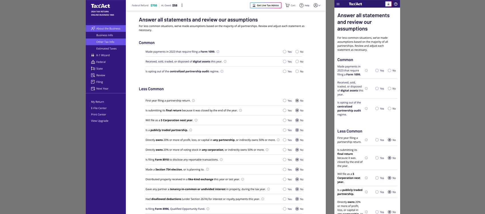
User liked the grouping of statements being helpful and also the preselected answers for uncommon ones.with lists visually and their interactions.
4. Launch
Final Designs
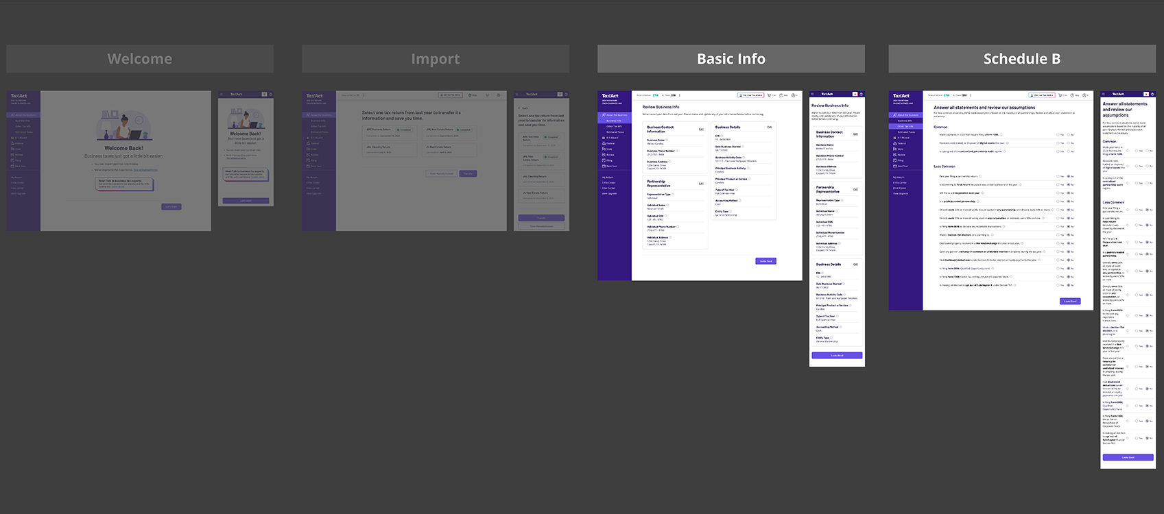
The final designs for the beginning of the experience for business tax users.
Summary Screen - Basic Info

Basic information that typically doesn't change but allows users to quickly scan and edit if needed.
Summary Screen - Schedule B
Schedule-B section that typically doesn't change but allows users to quickly scan and edit if needed.
Why this worked
- Condensed 30+ screens of interactions to 1 list of statements
- Revised the copy to a 5th grade reading level and got straight to the point
- Gave every statement an additional info for users who needed further clarification
- Grouped the most popular interacted with questions to the top and least to the bottom (from analytics)
- Some statements have further questions only if the user hits 'yes' and it relates to them
- For new users, automatically answered 'No' for uncommon statements for confidence that these probably don't relate to you unless you know about it and can easily change it