Team
Product Manager
2 Software Developers
Tax Developer
Quality Assurance
Key Contributions
Heuristic evaluation
Competitive analysis
Research
Using analytics
Wireframing and prototyping
The Problem
The completion rate for returning customers dropped sharply, with 58% of their abandonments occurring in the product’s opening section.
My Contributions
Successfully convinced the Product Manager and leaders on this design solution. Originally, the Product Manager just wanted to have a blurb on each screen that said this is how the user answered last year.
Impact
After implementing these changes we found that on avg, returning users spent 4 less days completing their business taxes. Our team was acknowledged by the CEO and other executives from the positive results.
Learning
Increased NPS score: 49.3 to 56.2
Decreased exit rate in basic info: 36% to 20%
Improved completion rate by 10.7%
Reduced avg time to finish business taxes from 12 days to 8 days
Old Designs
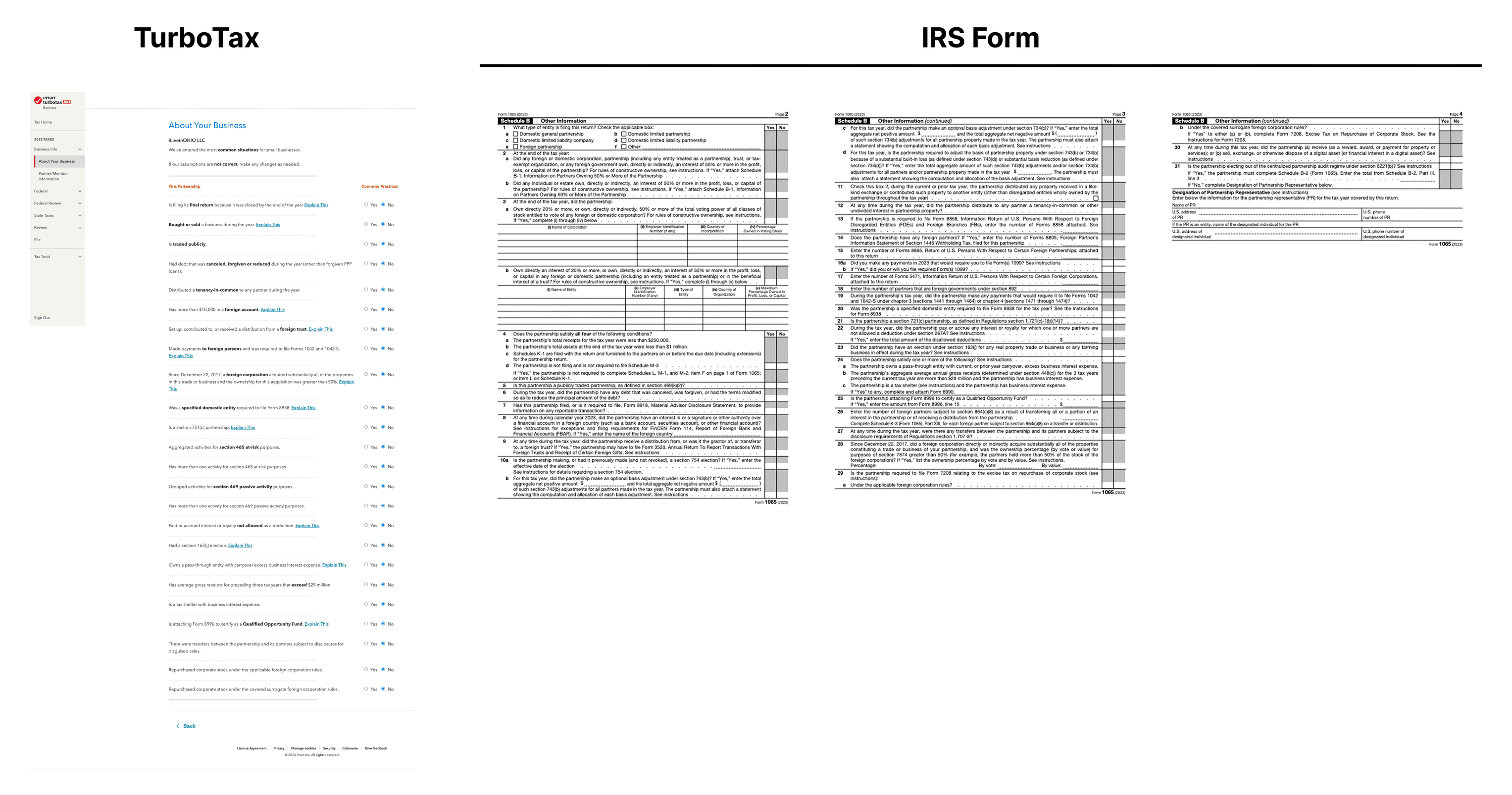
Difficult to know where you are or how to navigate around
Information overload on each screen and confusing
Returning users have to go through every question again and hit continue with their answer populated from how they answered the previous year

Looking at Turbo Tax and even the manual tax form from the IRS is only 3 pages long (ours is 40+ screens of the same information).
Research
Findings of Old Screens
Confusion with the content on most screens
Lack of additional details (users go to Google a lot)
No visual indicator for progress of a section
Unclear navigation
New Designs
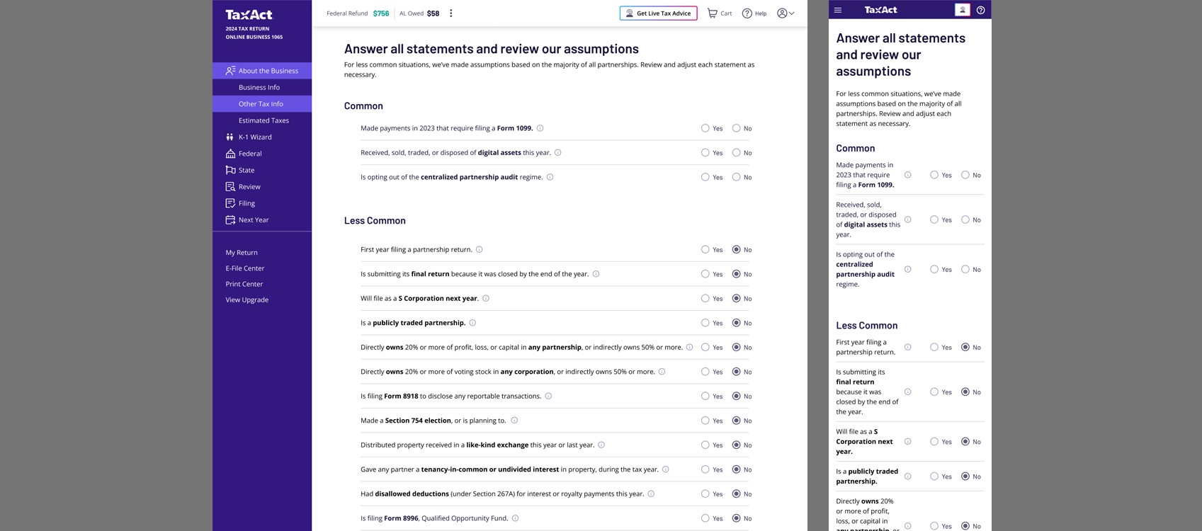
While almost all business users use desktop to file their business taxes, it is still important to think of the future and smaller screen sizes when designing. The goal was to design clear, engaging, and accessible alternatives to each question on one screen.
Outcome
Condensed 30+ screens of interactions to 1 list of statements
Revised the copy to a 5th grade reading level and got straight to the point
Gave every statement additional information for users who needed further clarification
Grouped the most-interacted-with questions at the top and the least at the bottom, based on analytics
Some statements reveal further questions only when the user selects “Yes” and the question applies to them
For new users, automatically answered “No” for uncommon statements, giving them confidence that they probably don’t apply while keeping the choice easy to change
Other Projects
THAT LEFT
THE FIGMA FILE.

" height="17px" id="X0qoSjNdU" width="18px"/></svg>)
" height="16px" id="PCi6OueVc" transform="translate(0 0)" width="12px"/></svg>)
" height="15.75px" id="YcpC6RCx4" width="15.737199630737305px"/></svg>)


Still interested…
12+ ( 7 as a Visual Designer and the last 6 as a Product Designer)