Team
Product Designer
UX Writer
Product Owner
2 Engineers
Key Contributions
Led Strategy
Research
Listened to customer service calls
Reviewed analytics
The Problem
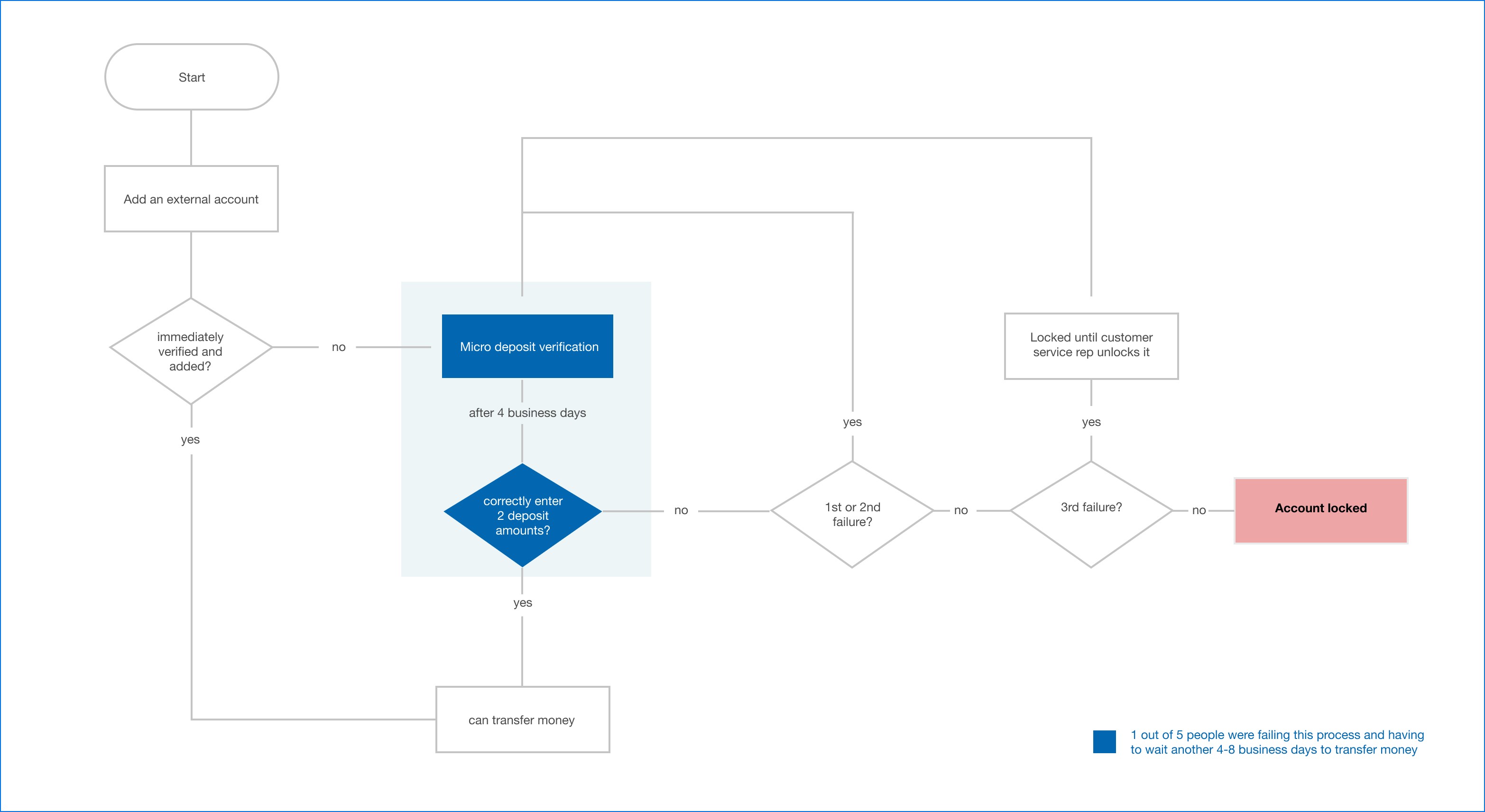
Nearly 20% of users attempting to verify their accounts through micro-deposits were unsuccessful, forcing them to wait 2–4 business days (often up to a week) before trying again; preventing many from completing money transfers.
My Contributions
From research insights and talks with customer service, I created and updated screens for the micro-deposit process.
Desired Outcomes
Reduce the current 20% failure rate of verifying micro-deposits
Reduce call volume surrounding external accounts and micro-deposits
Reduce negative feedback towards system navigation
Learning
Both qualitative and quantitative research are necessary and go hand in hand.
The value of establishing relationships with customer service reps and also listening in on customer service calls.
The best user experience for the user's goal will always prevail. In this example, people that want to transfer money aren't going to wait days or weeks when they know they can use another service to do the same thing almost instantaneously.
Old Designs
Users were confused between “Linked Accounts” and “External Accounts”. Linked accounts only allowed viewing balances, while external accounts were needed to transfer funds.
There was no upfront communication letting users know it takes 2-4 business days to receive micro-deposits and another 2-4 days to transfer funds.*
* If the verification is unsuccessful, it will take another longer.
Users were only notified by email when their micro-deposits were ready, and the email used outdated interface instructions.
The amount fields were confusing, and there was no review screen before submission.
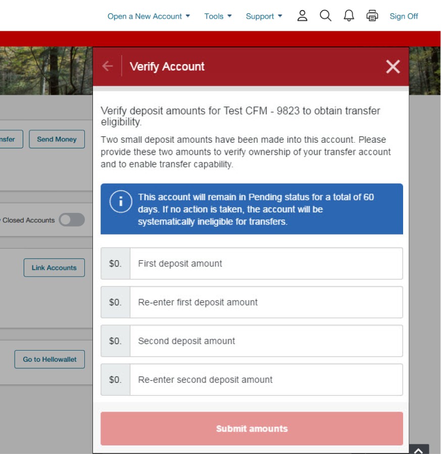
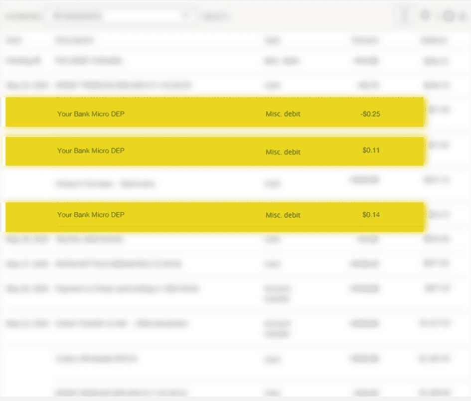
The screenshot below shows that the micro-deposits order from the order deposited to the bank account was backwards which definitely could cause confusion and mistakes.
To understand the current flow, I reviewed screens and communicated with customer service, other designers, engineers and more.
Research
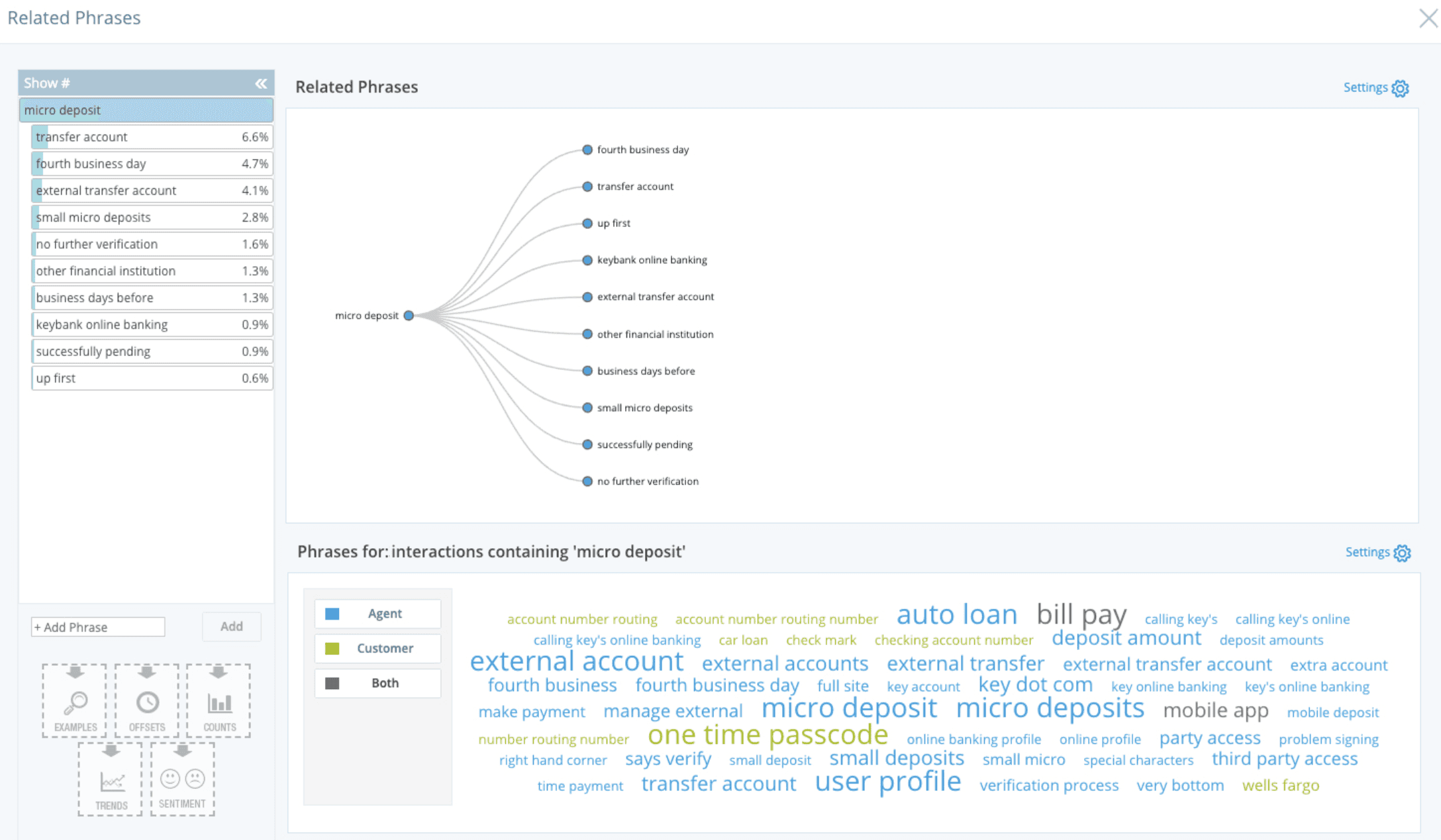
We got access to customer service's call transcription software, which sorts calls by topic. This was incredibly helpful for spotting pain points. The best part was being able to pull up actual recorded calls based on specific words or issues, so we could really dig into what users were struggling with.
New Designs
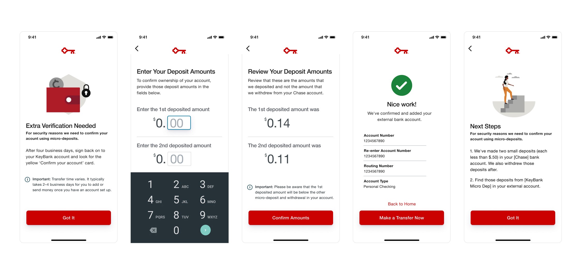
Built new screens and updated existing ones to make the micro-deposit verification process clearer and give users more confidence so they can confirm their account and get to transferring funds faster.
Outcome
These designs were being implemented when I left the company. In talking to customer service reps, we were all confident that these newer designs would add significant value for users, with the ultimate goal of reducing failure rates.
Other Projects
THAT LEFT
THE FIGMA FILE.

" height="17px" id="X0qoSjNdU" width="18px"/></svg>)
" height="16px" id="PCi6OueVc" transform="translate(0 0)" width="12px"/></svg>)
" height="15.75px" id="YcpC6RCx4" width="15.737199630737305px"/></svg>)


Still interested…
12+ ( 7 as a Visual Designer and the last 6 as a Product Designer)